

The Hidden Bedroom Color Trap That Keeps You Wide Awake
Most people jump into home makeovers thinking about expensive headboards, trendy rugs, or dramatic furniture, but genuine home improvement starts with how your space makes you feel when dusk falls. If you find yourself tossing and turning until 2 a.m. while your brain races on high alert, your wall paint might be actively sabotaging your sleep cycle. You do not need messy, unsafe renovations or overpriced sleep gadgets to fix this. Understanding practical bedroom color psychology can completely change how your nervous system unplugs before sleep, giving you back your nightly peace in a single afternoon.
I spent six long months tossing and turning every single midnight, staring blankly at my bedroom ceiling. My eyes burned, my body felt completely drained, yet my brain refused to shut down.
Every tiny work worry played on repeat like a loud broken record. I blamed my cheap mattress, my caffeine habits, and even my pillow height.
Then one evening, my friend walked into my room, took a quick look around, and gasped. She asked why I chose a bright, glossy lemon-yellow accent wall right directly across from my pillows.
I thought yellow was cheerful and energetic. That was my exact mistake.
My bedroom felt like an early morning boardroom rather than a quiet sanctuary. My eyes were taking in high-energy light reflections every time I tried to wind down.
Millions of hardworking people face this exact invisible struggle every night inside their own homes. You invest in blackout curtains, white noise machines, and expensive herbal teas to find genuine peace.
Yet you step inside your room and your nervous system instantly tenses up without your conscious permission. Bright reds, intense yellows, and cold clinical whites signal daytime alertness straight to your optical nerves.
This sensory friction creates silent mental fatigue that lingers throughout your workdays and weekend mornings. You deserve a bedroom that drops your shoulders the exact second you step across the doorway.
Understanding basic bedroom color psychology changes the way your mind processes evening safety and peaceful rest.
Quick Action Checklist, Choosing Paint for Deep Sleep
- Ditch High-Glare Hues: Drop bright lemon yellows and glossy whites; switch to proven relaxing bedroom paint colors like smoky slate, chalky sage, and warm greige.
- Match Your Bulbs to Your Walls: The best paint colors for sleep and relaxation will fail completely under harsh 5000K commercial LEDs. Stick strictly to warm white 2700K bulbs to soothe your optic nerves.
- Pick Light-Absorbing Finishes: Shiny finishes cause distracting light scatter in the dark. Opt for flat matte or low-luster eggshell finishes to wrap your room in cozy stillness.
- Anchor Your Undertones: Put bedroom color psychology to work by picking shades balanced with subtle gray or earthy clay bases that naturally lower your evening heart rate.
 How Your Brain Decodes Wall Pigments at Night
Your eyes do not stop processing surrounding hues simply because dusk settles outside your windowpane. Specialized photoreceptor cells inside your retinas pick up light wavelengths and send immediate alerts to your brain.
These light messages head directly toward the hypothalamus, the master control center for your hormones. If your bedroom walls bounce intense, short, vibrant waves, your brain postpones melatonin production.
Your body remains tricked into believing the sun is still high in the afternoon sky. That keeps your baseline heart rate slightly elevated when it should be gently sinking down.
Soft, muted tones with long, gentle wavelengths produce the opposite biological reaction in your body. They calm the sympathetic nervous system and encourage slow, rhythmic breathing patterns.
This is where the science of relaxing bedroom paint colors becomes a practical home remodeling tool. You are not simply decorating an empty space; you are tuning your biological sleep engine.
The Chromatic Chaos: Tones That Secretly Stir Stress
Most homeowners pick a color simply because it looks bright and clean on a tiny store sample. However, when that same shade covers two hundred square feet of wall space, the visual volume multiplies.
· High-Gloss Stark White: While popular in modern magazines, pure stark white reflects artificial blue light relentlessly and feels sterile.
· Fiery Reds and Corals: Red pigments raise respiration rates and trigger subtle emotional urgency.
· Vibrant Sunshine Yellows: Yellow activates daytime cognitive focus, making racing thoughts much harder to quiet down.
· Neon Undertones: Any paint with sharp, saturated undertones keeps your optic nerve in an active scanning mode.
When you strip away these visual stressors, your bedroom walls stop competing for your brain's attention. Quiet hues give your mind the blank canvas it requires to release daytime tension naturally.
Pro Remodeler Rule: Always check the LRV index printed on the back of paint swatches. Sticking to an LRV between 35 and 55 keeps your relaxing bedroom paint colors from bouncing stray streetlights back into your eyes while you rest.
The Calming Spectrum: Science-Backed Shades for Pure Rest
Soft Dusty Blues: The Biological Heart Rate Slower
Cool blues sit at the very top of sleep research studies across the globe. Blue wavelengths visually simulate open twilight skies and deep, still water surfaces.
Exposure to low-saturation blue helps your blood pressure dip into a gentle restorative state. It creates a reassuring visual stillness that makes evening meditation or quiet reading feel effortless.
Avoid royal blue, deep navy, or bright turquoise when aiming for pure evening relaxation. Instead, focus on slate blues, smoky denim, or pale morning mist tones that carry subtle gray undertones.
These muted variations absorb excess bedroom light rather than bouncing it back across your bed linens. They set a serene, cool mood that naturally supports your body’s evening temperature drop.
Earthy Greens and Sage: Tapping Into Basophilic Calm
Human eyes are naturally wired to feel secure when surrounded by lush natural foliage and gentle greenery. Bringing muted botanical greens onto your bedroom walls creates an immediate basophilic connection.
Soft sage, muted eucalyptus, and gentle moss greens remind your primal mind of shelter and steady resourcefulness. These shades quiet mental chatter because they feel grounded, organic, and timeless.
Green sits in the absolute center of the visible color spectrum, making it the easiest hue for your eyes to view. Your eye muscles require zero strain to focus on soft olive or chalky sage surfaces.
This optical ease helps melt away eye fatigue caused by staring at computer screens throughout the workday. Paired with natural wood furniture, muted green turns any basic sleeping space into a woodland retreat.
Pro Tip: The Daylight Swatch Mistake I Will Never Repeat
I used to paint tiny sample patches on my bedroom wall and judge them at noon on a sunny Saturday. That huge mistake cost me an entire weekend of repainting.
A shade that looks perfectly sweet in noon sunlight can turn cold, spooky, or overly dark when night falls. Now, I always paint large foam boards and view them at nine in the evening under my actual bedside lamp.
My 48-Hour Nightstand Card Test:
Never rely on daylight alone. Paint a 12x12-inch scrap board with your shortlisted shade and prop it directly on your nightstand beside your pillow. Walk into your room at 7:00 p.m., 9:30 p.m., and right before turning off your lights. If the color suddenly appears muddy, cold, or glaring under your actual reading lamp, you just saved yourself hundreds of dollars on a shade that would have ruined your sleep.
The Power of Muted Earth and Gentle Neutrals
Warm Grieve and Soft Oatmeal
Stark gray can feel cold and dreary, while yellow-tinted beige often looks dusty and outdated. The sweet spot for modern peaceful bedrooms is warm grieve a balanced blend of gray and creamy beige.
Grieve provides a gentle backdrop that wraps around the room like a heavy cashmere blanket on a cold night. It does not demand any emotional reaction from your thoughts, allowing your mind to rest.
When choosing a neutral, always look for undertones of mushroom, linen, or pale stone. These grounding neutrals reflect warm bedside lighting with a cozy, candle-like softness.
They also blend seamlessly with textured blankets, woven rugs, and linen drapes. A warm neutral wall prevents sensory overload, leaving you feeling emotionally steady and grounded.
Muted Lavender and Misty Heather
Many people dismiss purple because they picture sweet candy shades or childish nursery pastel walls. However, dusty lavender mixed with heavy slate or smoky charcoal creates incredible emotional stillness.
Soft heather tones have been shown in sleep trials to encourage alpha brainwave generation before sleep. Alpha brainwaves are the exact frequency your brain produces when you slip into a peaceful daydream.
The secret lies entirely within the gray undertone of the paint mix. You want a lavender that looks almost like stormy evening clouds with just a hint of wild violet.
This creates an artistic, sophisticated space that feels deeply personal and wonderfully quiet. It works especially well in rooms that do not receive abundant natural daytime light.
Lighting Harmony: Why Undertones Make or Break Your Walls
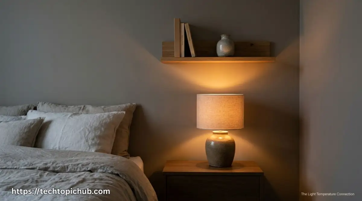
Here is a big lesson I learned after repainting my room three times in one year: never choose your wall shade strictly off tiny paper strips under bright hardware store lights. Even the best paint colors for sleep and relaxation will fail if you do not test them under your actual bedside lamp at 9:00 p.m. Taking two minutes to test a sample board against your nightstand lighting will save you hundreds of dollars and protect your peace of mind.
A soft, dreamy dusty blue can look dirty and greenish under harsh, cool daylight bulbs. Similarly, a warm oatmeal wall can look unpleasantly orange if your light sources are overly amber.
Before you spend a single dollar on paint, watch this quick visual demonstration to see how simple bulb swaps instantly turn cold walls into a cozy retreat. It takes only two minutes, and it will help you avoid the most common lighting trap before reading the rest of our room guide below!
Always aim for warm white light bulbs rated between 2700K and 3000K for your bedroom fixtures. This warm spectrum softens the edges of your room and activates the soothing pigments in your paint.
Avoid 5000K "daylight" LED bulbs in sleeping quarters at all costs. Those bulbs mimic harsh midday sun, completely ruining the soothing effect of your carefully chosen wall shade.
Comparison: Wall Color Families and Their Sleep Impact
|
Color Family |
Emotional Impact |
Optimal Bedroom Undertone |
Recommended Lighting |
|
Dusty Blue |
Lowers heart rate, promotes stillness |
Slate, smoky gray, mist |
2700K Warm White |
|
Sage Green |
Grounding, reduces screen fatigue |
Olive, eucalyptus, clay |
3000K Soft White |
|
Warm Grieve |
Cozy security, zero sensory noise |
Oatmeal, stone, mushroom |
2700K Warm White |
|
Muted Lavender |
Calms racing thoughts, promotes dreams |
Heather, slate, pewter |
2700K Warm White |
|
Deep Charcoal |
Enclosing, cave-like intimacy |
Blue-black, deep espresso |
2400K–2700K Warm Amber |
Myth vs. Reality in Bedroom Remodeling
There are dozens of outdated interior painting rules that lead homeowners straight into frustrating design choices. Let us clear up the most common misunderstandings before you pick up a roller:
· Myth: Dark bedroom walls always make a small room feel suffocating and cramped.
Reality: Deep, muted colors like charcoal or moody navy actually make wall boundaries visually recede into shadow. This can create a protective, womb-like atmosphere that feels incredibly safe and restful for light sleepers.
· Myth: Pure bright white is the cleanest, most peaceful color choice for any home space.
Reality: Pure white reflects every stray light beam from streetlamps and phone screens, keeping your retinas active. Without soft undertones, clinical white often feels sterile, cold, and mentally uninviting at night.
· Myth: You should always match your bedroom paint directly to your living room colors.
Reality: Living rooms are social spaces meant for active conversation, entertaining, and high energy. Your bedroom serves an entirely different biological purpose and demands its own dedicated calming palette.
Selecting the Right Sheen for Maximum Tranquility
Most people spend weeks picking a color shade and only two seconds choosing their paint finish. Yet the sheen level completely changes how peaceful a color feels once it cures across your walls.
Glossy and semi-gloss paints create sharp light bounces and show off every tiny wall imperfection. These shiny reflections catch your peripheral vision at night, creating subtle optical distractions while you try to relax.
For a deeply restful room, stick strictly to matte or flat finishes. Modern premium matte paints are durable, wipe able, and absorb stray light like soft velvet.
If you have pets or young children and need extra wall scrub ability, choose an eggshell finish. Eggshell offers a microscopic hint of soft luster that still maintains a gentle, low-glare look.
By pairing low-sheen finishes with muted tones, you soften the physical boundaries of your entire room. Your bedroom transforms from four hard drywall panels into a quiet, protective sleep sanctuary.
Take your time with sample pots, test them against the evening darkness, and trust how your body feels. When you choose the right calming pigments, your walls stop keeping you awake and finally help you rest.
Professional Secrets for Long-Term Bedroom Serenity
The Forgotten Fifth Wall: Painting Your Ceiling for Sleep
Most people spend days agonizing over wall colors, only to paint their ceiling with flat builder-grade bright white. That sudden break in tone creates a harsh, boxy contrast right above your pillow.
When you lie down at night, your gaze naturally rests on the ceiling before your eyelids close. A glaring white ceiling bounces shadows from streetlights and hallway cracks, keeping your brain mildly alert.
To maintain continuous calm, paint your ceiling in the exact same color as your walls, but lightened by roughly twenty percent. Alternatively, you can use a velvety ultra-flat matte finish in a warm creamy linen or smoky mist.
This technique erases hard lines where your walls meet the ceiling molding. The entire room wraps around you like a protective cocoon, helping you disconnect from daily stress immediately.
The Modified 60-30-10 Rule for Sensory Balance
Interior designers frequently talk about the 60-30-10 color rule, but standard decorating guides use it to create high visual excitement. When your goal is peaceful slumber, you must adapt this formula to protect your mental energy.
Dedicate sixty percent of your room to your primary soothing base wall color, such as an earthy sage or muted slate. Use thirty percent for tactile secondary neutrals, such as natural linen drapes, washed cotton bedcovers, and natural oak furniture.
Reserve the remaining ten percent for your grounding accent accents, like a stoneware bedside vase or charcoal reading pillow. Never use this ten percent slice for neon accents, bright brass metals, or high-contrast patterns.
By keeping your accent tones close to your foundation palette, you prevent optical clutter. If you are also planning broader house updates, checking comprehensive home remodeling guides can help you coordinate whole-house color flow without unexpected design clashes.
Protecting Your Air Quality with Zero-VOC Pigments
A calming bedroom must appeal to more than just your visual senses; it must also support clean, easy breathing. Freshly painted walls often release lingering chemical fumes known as volatile organic compounds for weeks after application.
These fumes can cause subtle headaches, eye irritation, and restless nighttime breathing without you realizing the source. According to established indoor air quality standards for paints, modern low-VOC and zero-VOC formulas protect sensitive airways while you sleep [1].
Look for water-based, natural mineral or clay-based paints that dry without offensive petroleum scents. When your lungs rest easy in fresh air, your body drops into deep physical rest much faster.
Pairing clean formulations with proven relaxing bedroom paint colors gives your nervous system the ideal backdrop for true nightly recovery.
The Visual Hallway Transition: Calming the Threshold
One overlooked secret to bedroom peace happens outside the bedroom door. If your hallway is painted in glaring stark white or energetic golden amber, stepping into your bedroom feels like a visual shock.
Your retinas need a gentle transitional gradient to prepare your mind for evening downtime. Try using an intermediate neutral along your hallway trim or entryway corridor to soften that boundary.
This simple visual cue signals to your brain that the active daytime zone is ending. By the time your hand turns the bedroom doorknob, your mental tempo is already slowing down.
 Costly Mistakes That Ruin Bedroom Tranquility
Testing Only on Paper Strips under Store Fluorescents
The single most common mistake homeowners make is choosing a paint color straight off a tiny paper strip at the local hardware store. Aggressive, cool fluorescent commercial lights that never match residential living spaces blast those showroom aisles.
A shade that looks like a cozy dove gray on the rack can easily turn into an icy, depressing institutional blue on your bedroom wall. Paper swatches also lack the real-world texture and thickness of true liquid paint.
Never purchase several gallons based solely on a five-minute glance at a store chip. Buy two or three small sample pots and paint sizable swatches onto scrap drywall or poster boards.
Move those sample boards across different corners of your sleeping area throughout the day. Watch how the tones shift during morning coffee, late afternoon haze, and beside your reading lamp at night.
Overlooking Architectural Wood Tones and Flooring
Your bedroom walls do not live in an isolated vacuum; they reflect alongside your floorboards, carpet, and headboard. If you choose a cool slate-blue wall paint while your bedroom floor features orange-tinted honey oak, those surfaces will violently fight each other.
Opposite colors on the traditional color wheel, naturally create intense graphic contrast and visu